1. Simple & plain is better. You want the product to be the focus, not the distracting background or the props. You can use props, just make sure that they compliment the product & focus the attention back on the product. You don't want your item to become the background to your props. If you have lots of people commenting on the props or the background, it probably means that the focus is not on your piece.
2. It's not necessarily bad to have your first shot be a close up. Focus on an interesting detail or the workmanship that has gone into the item. Draw the viewer in, then move back to the big picture.
3. Think about how the item will look in a thumbnail, this may be the first way a customer will view your item. Will it stand out among the other thumbnails? Will the viewer be able to tell what the item is? Will they be intrigued enough to click on the item?
4. Crop your shot so that you product takes center stage & one of the best tips I've seen: crop your shot square. This is the format that Etsy uses for the thumbnails & you can be certain that your product will be seen in the 'just listed' stream, as well as in your last 4 shots.
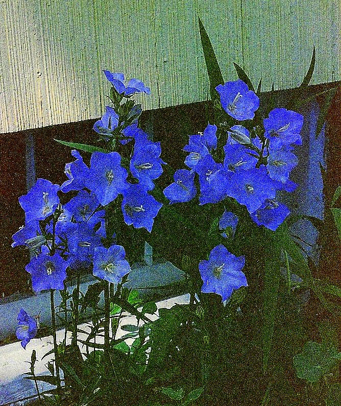
5. Natural light is best. The colors are truer & they won't have the yellow tinge that often comes from fluorescent light or the glare that comes from a flash. Adjust your camera settings so that white turns out white & black comes out black. You can also do this in post editing (there are many great free programs available: my favorite Picnik, Irfanview, Picassa ...)
Here are a few of my before & after shots:

Before shot taken on a fabric covered footstool. The red background is distracting. It's plain, but the bag handles, also red, fade in to the background. The angle is 'wonky,' so while this is not a horrible shot, it's a meh shot. It doesn't grab attention, ultimately forgettable...
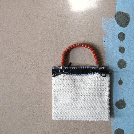 |
| White Handbag: Fancy Free |
White bag
After shot: The background is still basically plain, the colors contrast & compliment the bag & they're nuetral, so not overly distracting. The light pattern (ok, I'm a sucker for light patterns...) adds interest, but still doesn't distract from the bag. The light is natural here, no flash, so the colors are truer. The before picture was taken under florescent light, so it has a yellowish tinge, adding an old fashioned, frumpy look.

Before picture: It's a close up & has good detail, but the background is kind of distracting. Even though it's blurred & fairly plain, there's too much of it & it does nothing for the headband. I was trying a 'laundry strewn about by the wind' look. The biggest problem is that they're just hanging there & there's no indication of what they look like when worn...
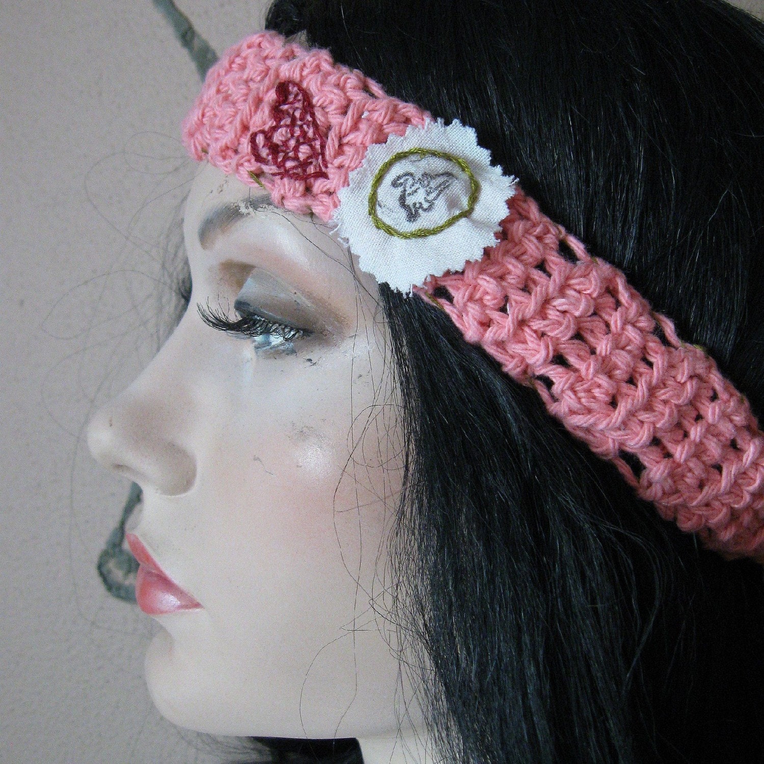 |
| Headband: Preppy Punk |

Before: There are many issues with this photo, glare from a flash, for a start. The background is plain, but the yellow is to bright & distracting, the green might have been better. It was even worse, as I started from too far away, so not only was there yellow & green, but white wicker & the pin itself was a speck, one of those "what is it?" shots...
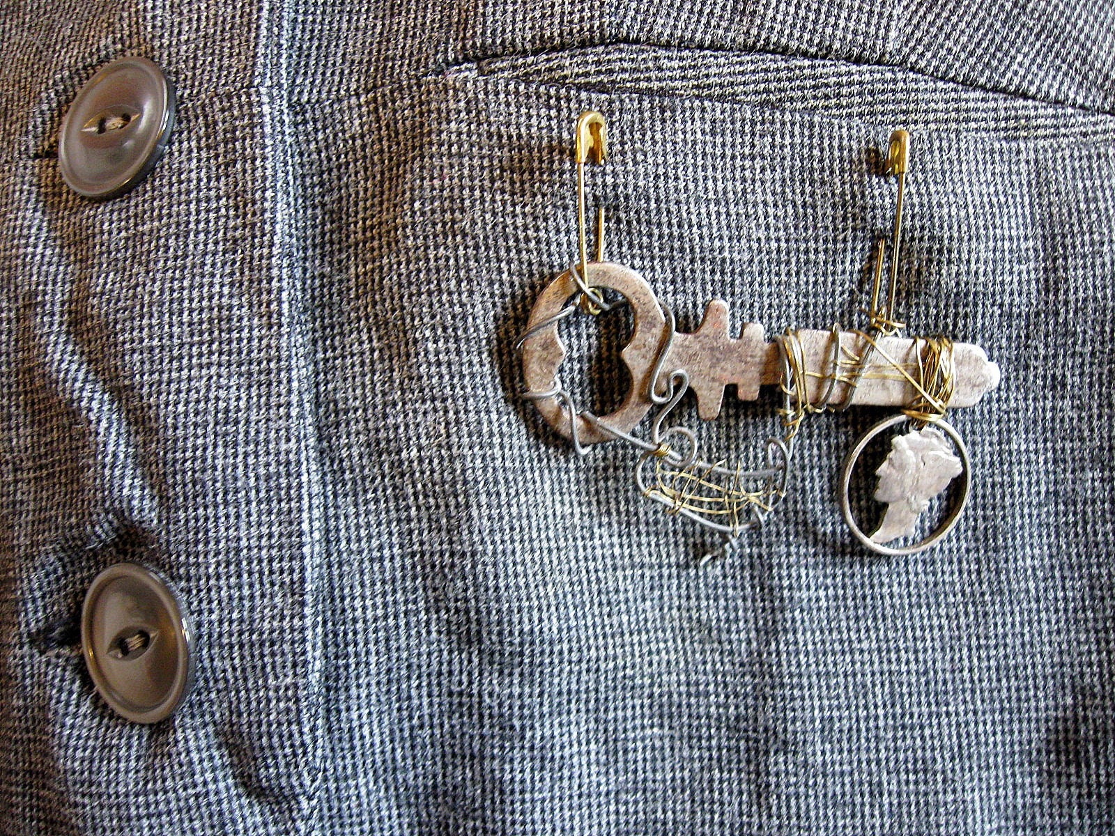 |
| Steampunk Skeleton Key Pin |
This is better in some ways, not as good in others, so it still needs work. I've kept both in the shop, for now. This one is better, in that it shows what the pin looks like when worn & I've placed it in a unusual spot, on the pocket of a vest, to show that it's versatile. I wanted to show the buttons & the pocket to hint at the fact that it's on a vest (more of a Steampunk look). The tiny check on the vest may be a bit distracting & the pin is in the same color family, so it kind of fades into the background....
 |
| An update of the key pin. Just a bit of color in the background, but not enough to distract from the pin, itself |
So, as you can see, it's a constant process. I'm still working on more photos & the last tip that I have for you:
6. Create a clean & unified look for your shop. This has to do with branding & marketing specifically to your customers. It looks less cluttered & gives the customer something to focus on. If you can, when re-arranging your shop stagger the light & dark photos: light, dark, light, dark...This makes it easier for the customer to see each individual item & separates them from each other, making them stand out.
I hope that this has helped & given you some ideas for your own 'product shots.' Thanks for stopping by. SAM